🥷 [S2] Challenge 30
Just KNIME It, Season 2 / Challenge 30 reference
Challenge question
Challenge 30: Music Data App
Level: Medium or Hard
Description: The second season of Just KNIME It! is coming to an end, and just like last season we will celebrate it with an open-ended problem. We invite you to use your creativity to build a data app relating music tracks to their artists through interactive and insightful visualizations. Take a step further and use one of the datasets we provide to make your interface available in multiple languages. Note: As this is an open-ended challenge, we will not be supplying our own solution as we usually do. Feel free to explore the datasets as you see fit!
Author: Aline Bessa
Challenge analysis
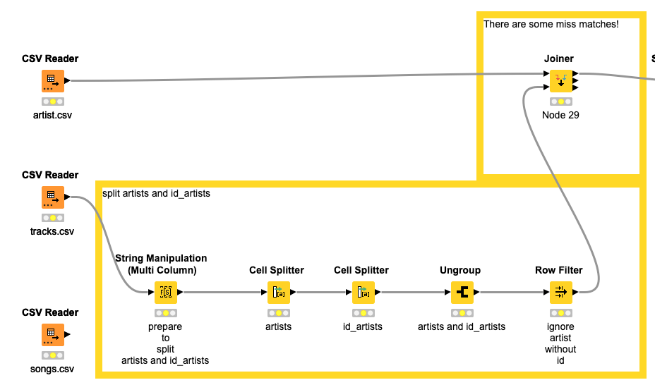
I discovered that this data comes from the spotify dataset. Both the artist ID and the track ID in the dataset are logical. In other words, if you come across an track's ID like this(2YarjDYjBJuH63dUIh9OWv), you can directly visit the track's page by accessing the corresponding URL(https://open.spotify.com/track/2YarjDYjBJuH63dUIh9OWv). The same applies to the artist ID.
In the dataset, the tracks.csv file contains this ID information. Therefore, I initially extracted the ID information from this data element and join it with the musician's name in the artist.csv file (excluding artists who didn't have a successful pairing). I did not utilize the songs.csv file.
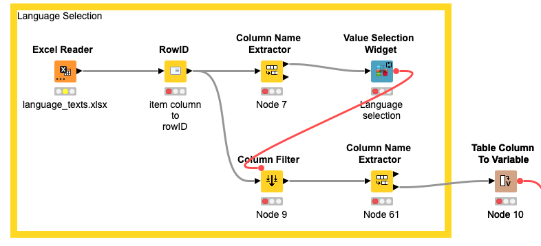
In the Excel file language_texts.xlsx, which deals with language switching, I added support for Chinese languages. I simply employed the 'Value Selection Widget' node to implement the language selection functionality of the interface.
Next, I tallied the number of tracks for each musician and displayed the top 20 musicians. The 'Bar Chart (JavaScript)' allows you to visualize the music output of these prolific top 20 musicians, while the 'Tile View (JavaScript)' provides slightly more detailed information compared to the bar chart.
However, there is a flaw in the workflow that prevents Tile View from performing single selections. To correctly retrieve the data and display the subsequent bubble chart, you need to first cancel the selection of the previous artist before selecting another one. Alternatively, you can directly choose the bar chart, as shown in the animation. Of course, you also have the option to utilize the 'Generic JavaScript View (JavaScript)' for more flexibility, although this may require some programming skills.
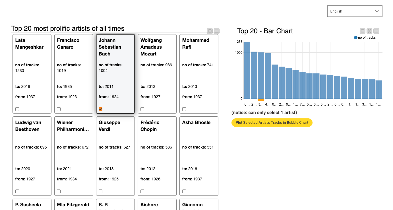
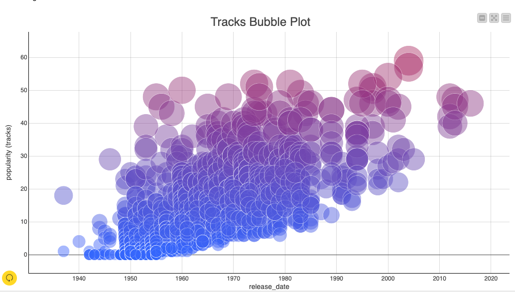
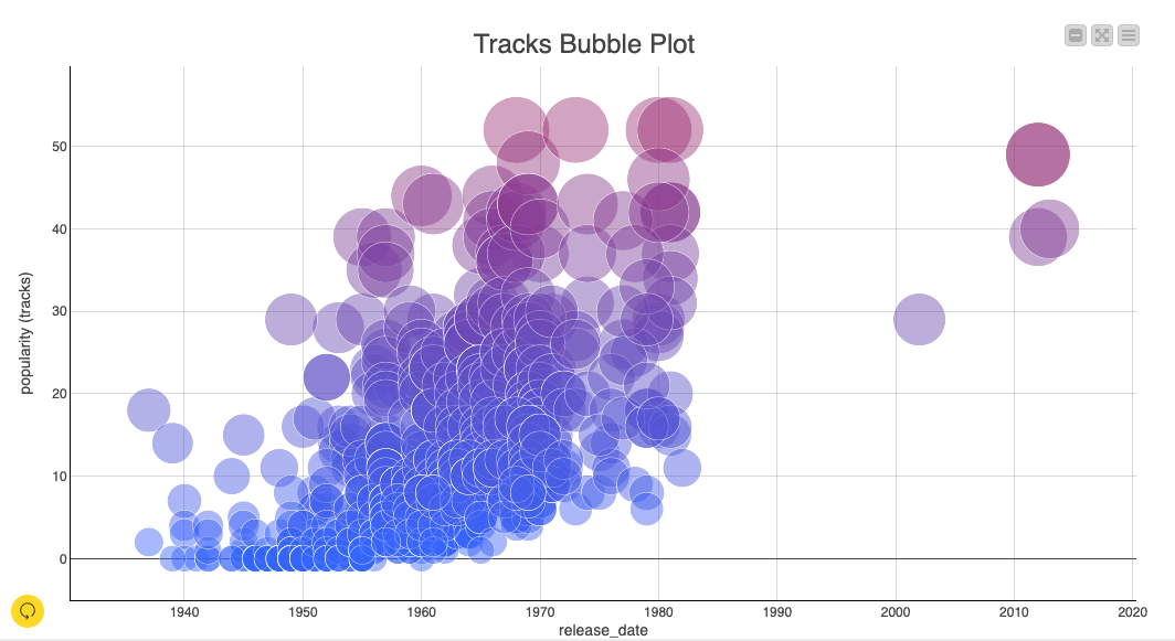
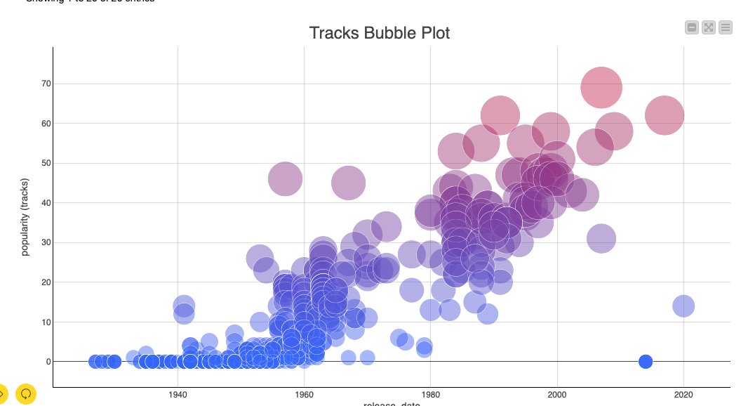
Alright. The bubble chart reveals some intriguing insights. Let's delve into bubble charts. The x-axis represents the year, while the y-axis represents the popularity of the track. In the chart, each bubble represents a track. The redder the color and the larger the size of the bubble, the more popular the track is. Different artists produce tracks with varying popularity over time.
For instance, take the following musician. In his early days, he had a song that was quite popular (around 20), which may have been their breakthrough in the music industry. However, in the subsequent decade, the songs he created were not as popular as his initial hit. Nevertheless, he persisted and with his growing experience, his skill level improved and his songs became consistently popular.
Yet, not all musicians follow this trajectory. For instance, this musician's music may not have been highly popular for many years, but he/her maintained a prolific output, indicating that music is his/her true passion.
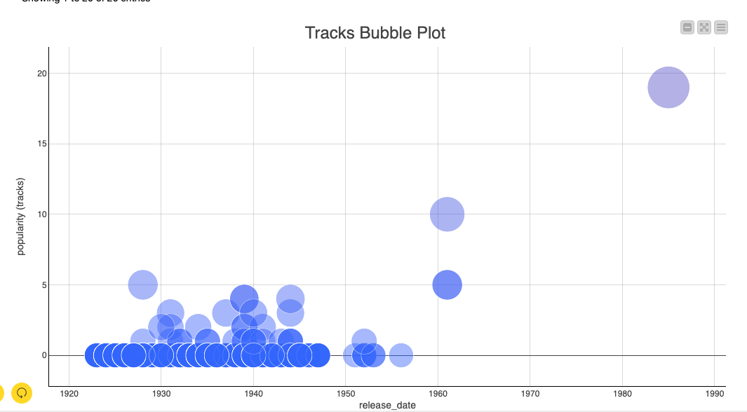
There are also musicians who temporarily halt their music creation due to various reasons, but eventually return to it after 20 years and still find success.
There is also the gradual growth path that some musicians follow.
Any thoughts?
What kind of growth path will your career take?