🥷 [S2] Challenge 28
Just KNIME It, Season 2 / Challenge 28 reference
Challenge question
Challenge 28: Funnel Plotting with Plotly
Level: Medium
Description: In this challenge you will play the role of data analyst trying to create a Stacked Funnel Plot from Plotly. While KNIME has many Plotly Plots through its KNIME Plotly extension, you could not find a funnel plot -- use the Python View node to create this type of visualization and show it off in KNIME! Hint: If you want, copy the code from the Plotly link above (e.g., the code for the "Stacked Funnel Plot with go.Funnel" plot) into the Python View node. Be sure to add this line after copy-pasting from the Plotly site: import knime.scripting.io as knio. Be sure to remove the line fig.show() as well. Finally, add this line to the very end of your code: knio.output_view = knio.view(fig).
If you would like to take this challenge from Medium to Hard, try creating your own data with the Table Creator node and passing it to at least one of the axis' variables in the Funnel Plot.
Author: Victor Palacios
funnel chart
Funnel charts are often used to represent data in different stages of a business process. It’s an important mechanism in Business Intelligence to identify potential problem areas of a process. For example, it’s used to observe the revenue or loss in a sales process for each stage, and displays values that are decreasing progressively. Each stage is illustrated as a percentage of the total of all values.
This question is interesting, and it is necessary for funnels to have an interactive component.
To explain the funnel chart, I will focus on Toronto's data, which can be understood through word of mouth.
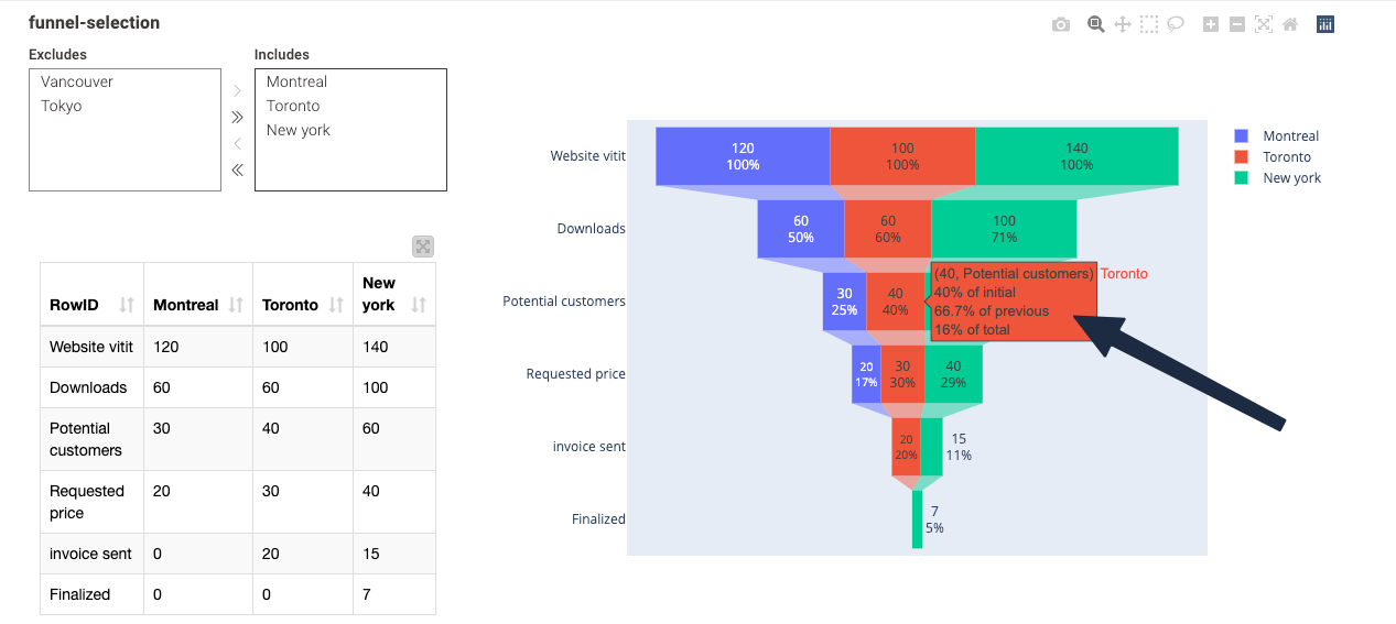
- The first row of the figure (40, Potential customers) is the absolute number of cells corresponding to the Toronto column in the table, the Potential customers row
- The second row of the figure, 40% of the initial, is obtained by dividing the absolute number by the first line of Toronto (referred to as the initial) Website vitit.(haha, the typo
vititis obtained by copying the original data of sryu). This is calculated as40/100 = 40%. - The third line in the figure is how much data was leaked from the previous funnel row, which is calculated as
40/60 = 66.7%. - The fourth row of the figure, 16% of the total, refers to
40/(100+60+40+30+20) = 16%. However, I am not entirely sure about the meaning of this particular figure in the context of funnel charts.(100+60+40+30+20)This addition doesn't feel practical enough...
Any thoughts?
- In KNIME, Python-related nodes are useful for debugging, as they resemble a Python notebook(can execute code line by line) and spyder(can see variables). They allow you to view variable values in the current environment and understand them by clicking on their names. In the future, it would be more beneficial to incorporate AI features.