🥷 [S2] Challenge 07
· 阅读需 2 分钟
Just KNIME It, Season 2 / Challenge 07 reference
Points worth mentioning
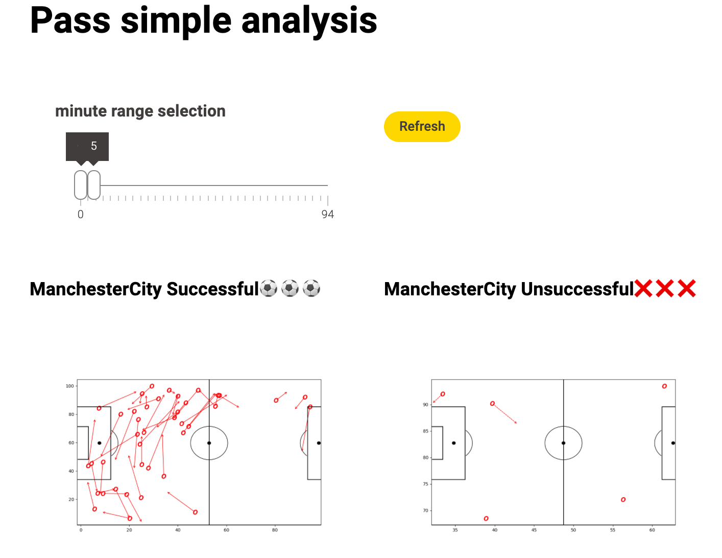
- I chose a slider to control the time frame.
- Well, in addition to the visualisation of Manchester City's successful passes, I also showed the failed passes, as well as Manchester United's passes. This is because I believe that the success or failure of one team's pass is closely related to that of the other. Of course, only the successful and unsuccessful passes are shown here.
Matplotlib vis
import knime.scripting.io as knio

import numpy as np
import matplotlib.pyplot as plt
import pandas as pd
import matplotlib.patheffects as path_effects
from matplotlib.patches import Arc

fig = plt.figure(figsize=(10, 6))

df = knio.input_tables[0].to_pandas()

h_a_colors = {
    'h': 'red',
    'a': 'blue',
}

for index, row in df.iterrows():
    x, y, end_x, end_y = row['x'], row['y'], row['endX'], row['endY']
    outcome_type = row['outcomeType']
    action_emoji = "O" # ⚽
    h_a_color = h_a_colors.get(row['h_a'], 'black')

    plt.scatter(x, y, marker='${}$'.format(action_emoji), s=100, color=h_a_color)

    linestyle = '-' if outcome_type == 'Successful' else '--'

    plt.annotate(
        '', xy=(end_x, end_y), xytext=(x, y),
        arrowprops=dict(arrowstyle='->', linestyle=linestyle,
            color=h_a_color
        )
    )

ax=fig.add_subplot(1,1,1)

#Pitch Outline & Centre Line
plt.plot([0,0],[0,90], color="black")
plt.plot([0,130],[90,90], color="black")
plt.plot([130,130],[90,0], color="black")
plt.plot([130,0],[0,0], color="black")
plt.plot([65,65],[0,90], color="black")

#Left Penalty Area
plt.plot([16.5,16.5],[65,25],color="black")
plt.plot([0,16.5],[65,65],color="black")
plt.plot([16.5,0],[25,25],color="black")

#Right Penalty Area
plt.plot([130,113.5],[65,65],color="black")
plt.plot([113.5,113.5],[65,25],color="black")
plt.plot([113.5,130],[25,25],color="black")

#Left 6-yard Box
plt.plot([0,5.5],[54,54],color="black")
plt.plot([5.5,5.5],[54,36],color="black")
plt.plot([5.5,0.5],[36,36],color="black")

#Right 6-yard Box
plt.plot([130,124.5],[54,54],color="black")
plt.plot([124.5,124.5],[54,36],color="black")
plt.plot([124.5,130],[36,36],color="black")

#Prepare Circles
centreCircle = plt.Circle((65,45),9.15,color="black",fill=False)
centreSpot = plt.Circle((65,45),0.8,color="black")
leftPenSpot = plt.Circle((11,45),0.8,color="black")
rightPenSpot = plt.Circle((119,45),0.8,color="black")

#Draw Circles
ax.add_patch(centreCircle)
ax.add_patch(centreSpot)
ax.add_patch(leftPenSpot)
ax.add_patch(rightPenSpot)

#Prepare Arcs
leftArc = Arc((11,45),height=18.3,width=18.3,angle=0,theta1=310,theta2=50,color="black")
rightArc = Arc((119,45),height=18.3,width=18.3,angle=0,theta1=130,theta2=230,color="black")

#Draw Arcs
ax.add_patch(leftArc)
ax.add_patch(rightArc)

plt.axis('off')
plt.xlim(0,120)
plt.ylim(0,80)

plt.show()

# Assign the figure to the output_view variable
knio.output_view = knio.view(fig)  # alternative: knio.view_matplotlib()
Another thoughts
- Matplotlib is a relatively slow solution.
- 2D Density Plot is a great visual solution in this scenario.
- The sunburst chart is also great.
- Obviously there are many factors that influence the success of the pass. In addition to the pass, there are many other types of data, but it is a pity that there is not so much time to analyse them.